Simple Static HTML Template✯
Simple Template✯
For those who want to avoid writing HTML, a very simple template has been created with:
- 6 HTML pages
- CSS
- some images
- 5 text files (containing the information you want to display)
- some JQuery scripts
An example of this template is available at the following address https://perso.isima.fr/~wiltestor/template_simple/index.html
Download the simple template
Some information about these pages:
- the email is obfuscated to prevent spam
- The "Publications" tab opens an iframe on the HAL website displaying your publications. If your HAL account is up to date, your personal page will be too.
- The colors used on these pages correspond to those of the LIMOS graphic charter
It is possible to quickly configure these pages by editing the text files and making modifications at specific locations
Modifying Information✯
-
Edit the content of the text files to display the desired information (
nomprenom.txt,pedagogie.txt, etc.). All text files are at the root ofpublic_htmlDo not touch the tags. -
Save your photo in place of the existing one in the
public_html/imgdirectory
respect the file name and format: photo.png
- Save your CV in place of the existing one in the
public_html/imgdirectory
respect the file name and format: cv.pdf
-
Edit your email in the
index.htmlfile At line 37, replace the four name and first name fields with your email addresshref="mailto:bastien.doreau(at)isima.fr">bastien.doreau (at) isima.frbecomeshref="mailto:prenom.nom(at)isima.fr">prenom.nom (at) isima.fr -
Edit the link to your publications in the
publications.htmlfile At line 36, replace the two name and first name fields with yours<iframe ... hal.archives-ouvertes.fr/search/index/?q=Bastien+Doreau"becomes<iframe ... hal.archives-ouvertes.fr/search/index/?q=Prenom+Nom"
Bootstrap Template✯
Presentation✯
A slightly more complex template has been created in HTML, JS and CSS. It allows:
- a rendering close to the LIMOS website
- responsive management via Bootstrap
- automatic display of publications deposited in HAL from the researcher's idHal
An example of this template is available at the following address https://perso.isima.fr/~wiltestor/template_bootstrap/index.html
Download the Bootstrap template
It is possible to quickly configure these pages by editing the text files and making modifications at specific locations
Page Architecture✯
______________________________________
|                                     |
|               HEADER                |
|_____________________________________|
|     |                               |
|  M  |         CONTENT               |
|  E  |                               |
|  N  |                               |
|  U  |                               |
|     |                               |
|     |                               |
|     |                               |
|_____|_______________________________|
|              FOOTER                 |
|_____ _______________________________|
The HTML pages "Home", "Research", "Teaching" and "Additional Information" are built on the same model.
Each of these pages integrates:
- a
<div id="header">tag for the logo and name - a
<div id="navigation">tag for the left menu - a
<div id="footer">tag for the purple block at the bottom of the page.
A script at the end of the page will replace these tags with HTML pages contained in the template folder, namely "header.html", "navigation.html" and "footer.html"
Thus, modifying one of these 3 pages will be reflected on all content pages.
The content you want to display must be inserted between the <!-- CONTENT --> and <!-- FIN CONTENT --> parts (NB: These elements are not HTML tags but comments)
This template includes a CSS file (main.min.css) and a JavaScript file (main.min.js) contained respectively in the "css" and "js" folders
Integrating a Title-Menu Block✯
This type of block is an element generated by Bootstrap. In HTML, it appears in the form:
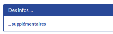
<div class="panel panel-primary">
    <div class="panel-heading">
        <h3 class="panel-title">Some info...</h3>
    </div>

    <div class="panel-body">
        ... additional
    </div>
</div>
To modify the title, edit it between the <h3 class="panel-title"> and </h3> tags
For the content, edit it between the following tags <div class="panel-body"> and </div>
To add a block, copy and paste the HTML block content above and modify the title and content.
Modify Name and First Name in the Header✯
Edit the template/header.html file and replace line 32 <b>Pascal LAFOURCADE</b> with <b>Firstname LASTNAME</b>
Modify the Home Page✯
The home page contains:
- a title between
<h2>and</h2>title tags - text with links
- a title-content block
- a set of photos (books)
- a 3-column title-content block
- text with bullets
All this information is found between <!-- CONTENT --> and <!-- FIN CONTENT -->
Modify Publications on the Research Page✯
A script will retrieve all publications linked to an author identifier called idHal from HAL
This script uses a web service on HAL and retrieves a JSON result which is processed and whose elements are formatted and displayed.
For information, the request sent is:
https://api.archives-ouvertes.fr/search/?q=authIdHal_s:"+idHalUser+"&start=0&rows=500&fl=uri_s,authFullName_s,title_s,docType_s,keyword_s,producedDate_s,journalTitle_s,conferenceTitle_s&sort=producedDate_s%20desc&wt=json
To modify this idHal, change line 109 the content of the idHalUser variable with your idHal
var idHalUser = "pascalafourcade"; → var idHalUser = "bdoreau";
No idHal yet? Create one here
Editing Responsive Content✯
To have responsive content, Bootstrap has designed a block system with 12 units per line
When the media is smaller, the blocks that are normally side by side are placed one below the other.
It is therefore not recommended to use tables but rather this block system for this template so that it is fully responsive
The principle is that a line can be broken down into 12 units, either 6 units + 6 units OR 4 units + 4 units + 4 units OR 1 unit + 10 units + 1 unit or ...
The idea is that the total number of units per line is 12.
In the code, this is translated as follows:
<div class="row">

    <div class="col-lg-3 col-md-3 col-sm-3">
        Content 1st Block of 3 units
    </div>

    <div class="col-lg-5 col-md-5 col-sm-5">
        Content 2nd Block of 5 units
    </div>

    <div class="col-lg-4 col-md-4 col-sm-4">
        Content 3rd Block of 4 units
    </div>

</div>
First, create a tag to define the line with <div class="row"> which you close at the end with </div>
Then inside, a tag indicating the number of units of the block if it is large (large), medium (middle) or small (small) <div class="col-lg-3 col-md-3 col-sm-3">
It is possible to have lines nested in others, for example:
<div class="row">

    <div class="col-lg-3 col-md-3 col-sm-3">
        Content 1st Block of 3 units which will also contain a line of 12 blocks
        <div class="row">
            <div class="col-lg-6 col-md-6 col-sm-6">
                BLABLA
            </div>
            <div class="col-lg-6 col-md-6 col-sm-6">
                BLOBLO
            </div>
        </div>
    </div>
    ...
French-English Bootstrap Template✯
Another template has been defined with the possibility of changing languages (FR / EN). It is heavier to manage due to duplicated HTML pages.
An example is available here https://perso.limos.fr/~basdorea/
Its principle lies in another navigation_en.html menu accessible via the English flag and directing to English pages.
Thus, in this template you will have the files index.html, index_en.html, recherche.html, recherche_en.html, projets.html, projets_en.html, peda.html, peda_en.html, infosup.html, infosup_en.html
Download the Bootstrap_en template
My Complete Personal Site with Pelican✯
For a personal site allowing the generation of static pages using markdown with Pelican:
This solution allows for the management of internationalization, writing mathematical equations, a search engine, etc.